Institutions & Target Audience
The type of Institutions that would produce these type of films would normally be independent Institutions such as 'Vertigo Films' or 'BBC Films'. This is because, Film noir is not as big compared to other major genres, meaning it will cost less to produce than a Hollywood blockbuster.

Audience Profile
Age: 20-45 Years old
Affluence: People who are unemployed or are not earning as much, as they can relate to characters in the films
Gender: Most likely males
Social Class: Between the D and E bracket
Race: White Audience
Interests: Crime dramas/stories. Normally, people who are interested in twists within stories.
Affluence: People who are unemployed or are not earning as much, as they can relate to characters in the films
Gender: Most likely males
Social Class: Between the D and E bracket
Race: White Audience
Interests: Crime dramas/stories. Normally, people who are interested in twists within stories.
Final Poster

Deconstruction | Film Noir Poster

Representation of Women
A clear connotation of a Film Noir poster. The 'Femme Fatale' is the superior gender, who has full control and authority over the male, due to her possessing the gun at the males throat. The usual representation of women in Film Noir films is portrayed within this film poster. She is looking directly at the camera, which possibly denotes courage and bravery. Whereas the male keeps his identity hidden as the hat covers most of his eyes which denotes mysteriousness and suspiciousness.
As you can see, from the original photo, I added a black and white coloring over the original. This contributes and provides the whole 'Film Noir' feel, which was missing when the half-finished poster was made. From the photos taken, I'm quite pleased with the outcome and how the photo fits in well with the background/props.


|
I managed to get a font from 'DaFont' which suits Film Noir films. I added a grey gradient overlay over the font, which gave the text a white to grey color from top to bottom. I also added a stroke around the text with a soft light filter. I feel this provided the text to stand out and blend in with usual Film Noir posters.
|
I changed the color of both the whiskey bottle and smoke to black and white. As from my research, I found out that most Film Noir posters consisted of three colors, two in which was black and white. In my opinion, I think these props were an asset, towards making this poster successful.
|
Equipment Used
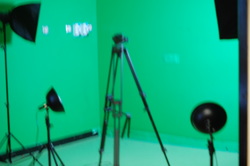  |
 These are the equipment I used, all in which aided me into completing the poster. The lighting was used, so I could create shadows of my liking. The tripod was used to keep the camera in a steady position, whereas without the tripod I would get blurred results. By using these type of materials, I am now fully aware on how to operate them. This may help me in the future, so when I am told to do another task, I could easily work with certain equipments. |
Evaluation
I'm quite pleased on how this poster turned out, even with my negative hopes. Many conventions of a Film Noir can be witnessed, for example, the 'Femme Fatale', shadows, whiskey bottle and smoke. The picture I took and the font I chose seems to blend in with the genre which can be seen as a positive. I'm quite proud of the title itself, along with the font chosen. I say this because to come up with a suitable title took so long, but eventually after long thinking, I finally came up with 'One Man's Misery', which suits both the genre and the plot. I probably should have kept the female's body instead of cutting halfway through, as this would show the seductive side she possess. However, despite this I'am still delighted with my finished poster. Overall, this task has enabled me to learn new Photoshop and camera skills. This project has given me an insight into the film industry as I now know how to make Film Noir Posters.
